Recently, I stumbled upon this book: The Best American Infographics of 2014 by Gareth Cook. It is covering a lot of infographics on topics from soccer to the history of English.
Big data is hot and it is everywhere. An infinitely large number of articles in print or broadcast journalism are based on numbers. Especially in print and online journalism it is of great importance to catch the data in one strong image and tell your story in one picture.
The artist David Byrne, quoted on brainpickings, remarks the importance of visual storytelling:
A good infographic … is — again — elegant, efficient, and accurate. But do they matter? Are infographics just things to liven up a dull page of type or the front page of USA Today? Well, yes, they do matter. We know that charts and figures can be used to support almost any argument. . . . Bad infographics are deadly!
One would hope that we could educate ourselves to be able to spot the evil infographics that are being used to manipulate us, or that are being used to hide important patterns and information. Ideally, an educated consumer of infographics might develop some sort of infographic bullshit detector that would beep when told how the trickle-down economic effect justifies fracking, for example. It’s not easy, as one can be seduced relatively easily by colors, diagrams and funny writing.
What is the best infographic to tell you story?
Piktochart is claiming there are 8 types of infographics:
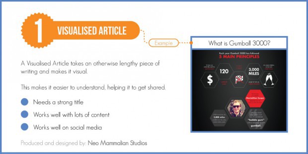
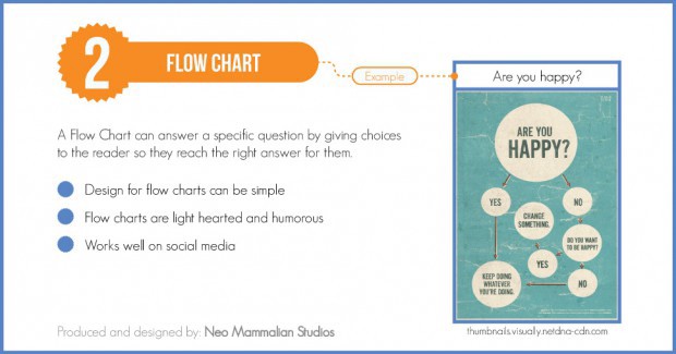
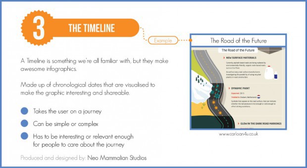
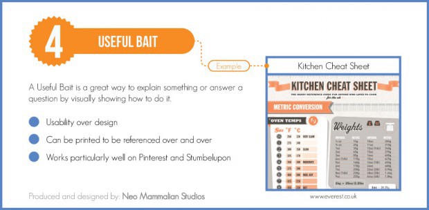
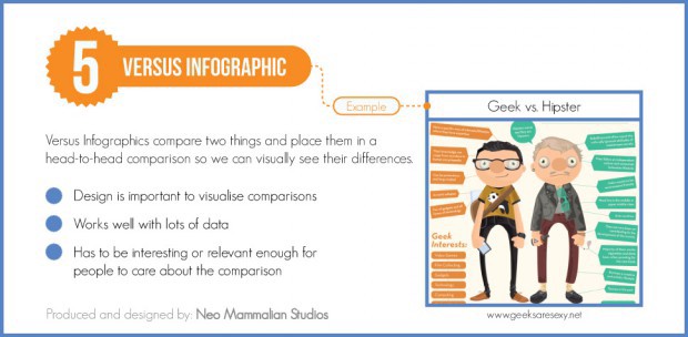
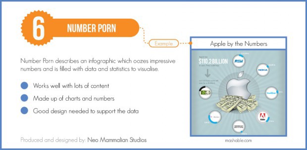
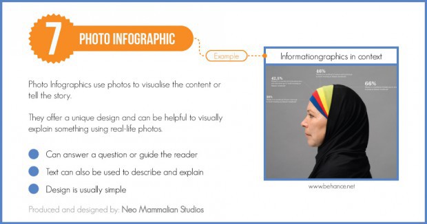
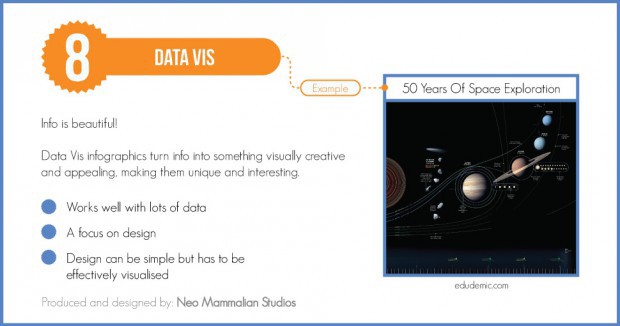
source: Piktochart
Some Of The Best
– The Washington Post recently did a wonderful series of infographics on the Ebola crisis.
But very popular and also to put the coverage on Ebola in perspective they made an infographic to feel ‘better about to chance to get Ebola':

The Post is putting effort in visual storytelling. Great Example is this page on ‘The Black Budget’, explaining the price of alle the covert operations of US intelligence.
Clear and clever storytelling with a lot of numbers.

– This one is simple and clean: This info-poster reveals the attitudes of Danes towards refugees and immigrants. And it is still one of my favourites.

– Titanic: we all know the story about the dramatic journey of the Titanic. From the price of a ticket over the number of life boats to the numbers of men, women and children dead. This infographic shows it all. It is large, but it contains everything you need to know about the Titanic. No accompanying article needed… It is designed by deathlytriforce.

– Talking about Storytelling? Caroline Paul and Wendy MacNaughton are living in San Francisco. One day they lost their cat only to find the animal back five weeks later. They were wondering which kind of adventures their favourite pet came across and they decided to stap a GPS to his collar. It resulted in the wonderful book ‘Lost Cat‘.

– Food for Thought & very, very simple. Also one of the best in my 5 star ranking:

Many more works to be found in The Best American Infographics of 2014, also in the book that covers 2013. On Amazon you get more suggestions of books on visual storytelling.
And of course, please, google.